Expressive in Motion. Iconic in Context.
Guided by product behavior, our brand comes to life through interaction, allowing its form, motion, and identity to adapt without losing its essence.
| Principle | Alignment question | Description |
|---|---|---|
| Adaptive | Chameleon by Design “Does this feel like Buzzvil in any context?” | The brand adapts to its context—logo color, partner environments, light or dark—without losing identity. We default to monochrome for a clean aesthetic but allow expression in partner contexts. Form and identity stay recognizable across every touchpoint. |
| Motion | Expressive in Motion “Would this be stronger in motion?” | Our brand comes to life through interaction and motion. Guided by product behavior, we prioritize vector, Lottie, and code-driven visuals over static imagery. Motion adds clarity and delight; static is a last resort. |
| Real | Real, Not Stock “Is this unmistakably ours?” | Imagery must be real: our product, our people, our space. Actual screenshots and flows, candid photos, authentic visuals. No stock photography. Trust and authenticity come from showing what we truly build and who we are. |
| Clarity | Clarity & Contrast “Is it legible and confident at a glance?” | We aim for a high-contrast, clean look: grayscale as primary palette, accent used sparingly. Typography is legible and confident; clearspace and hierarchy are non-negotiable. The brand should read at a glance. |
| System | One Coherent System “Does this fit our system?” | Brand guidelines, tokens, and conventions ensure one coherent system across all platforms and touchpoints. From logo usage to color, typography, and voice—consistency is how we build recognition and trust. |
Imagery
Motion Over Stills
Our brand is built to move. Static imagery is a last resort. When we do use it, every pixel must be real, purposeful, and unmistakably ours.
- Vector, Lottie, and code-driven visuals come first.
- Photos and screenshots earn their place only when they show something real. Our actual product, our actual people, our actual space.
Vector & Lottie First
SVG, vector artwork, and Lottie animations are our default. Clean, scalable, and brand-native. Used for illustrations, icons, diagrams, motion assets, and any visual that supports our design system.
Product Screenshots
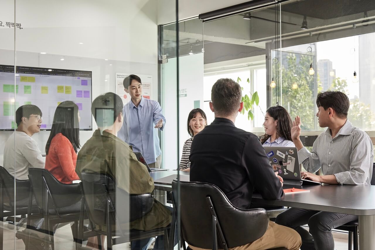
Pixel images earn their place when showing real products. Actual screenshots, flows, and interfaces, not mockups. Trust comes from showing what we truly build.
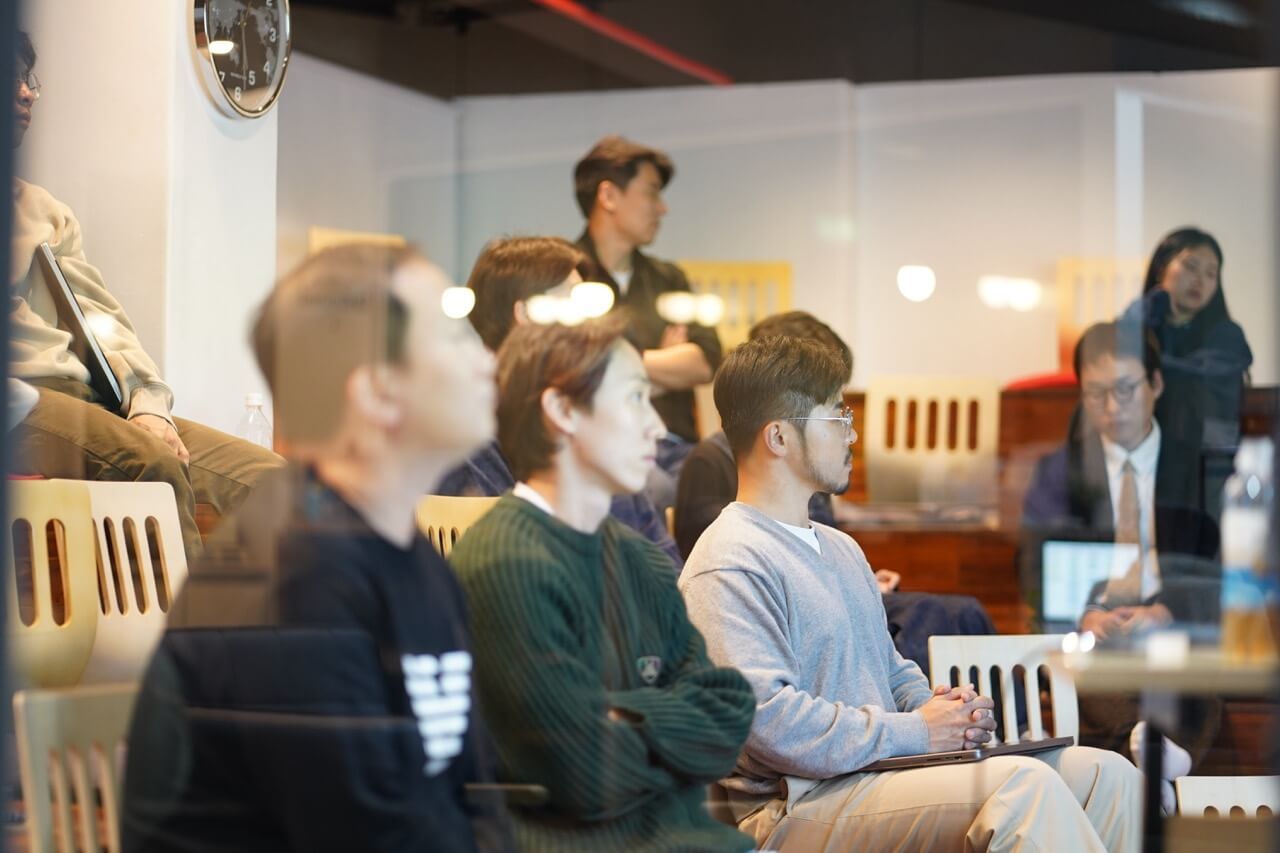
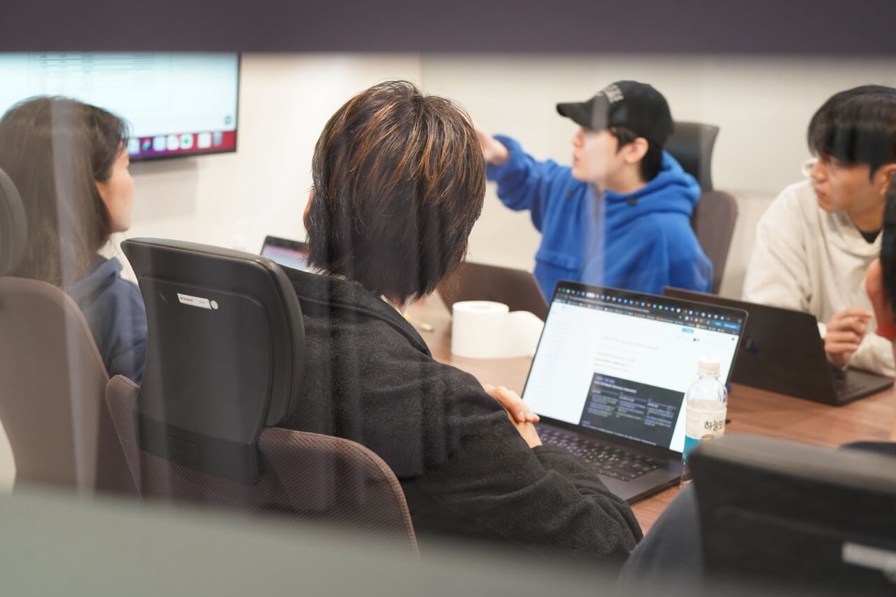
Our People & Space
Real photos of our office and members. Candid, unstaged, authentic. No stock photography. No getty images. Ever.
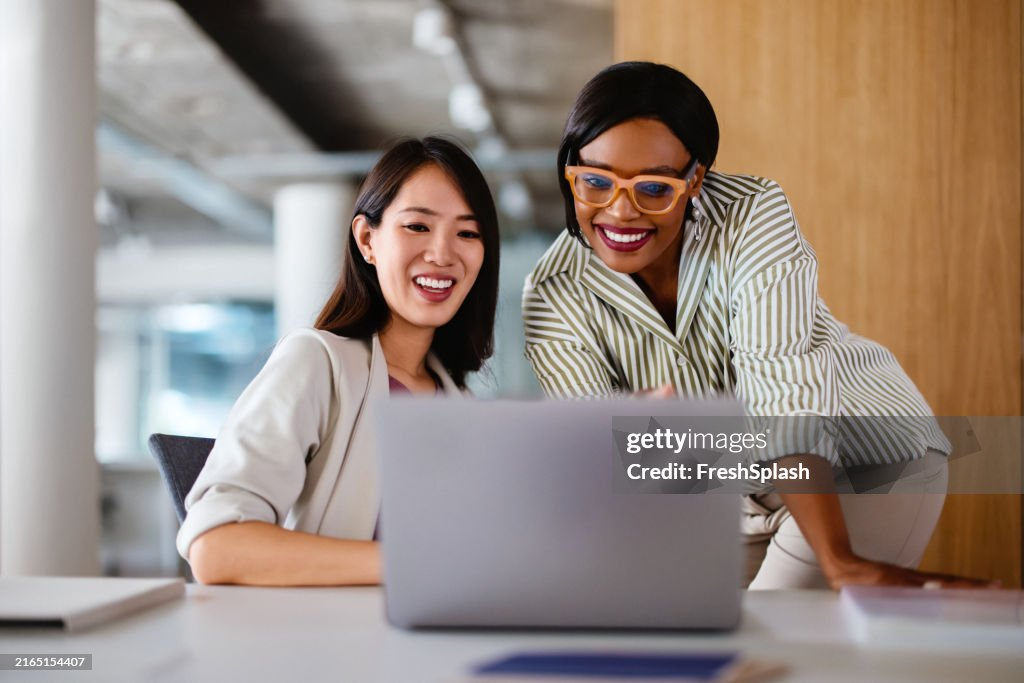
Don't: Stock photography
Don't: Staged scenes

Don't: Generic illustrations